One of the comments about my Tangram Alphabet Study for The Every Letter Project was that one of the letter forms looked like a bird. Although I’ve been developing other ideas, I couldn’t shake the comment from my head. So decided to explore it further.
The comment was made about tangram design #9, but the shape didn’t work well in a square shape (the trimmed shape of the paper I’ll print on). But while developing tangram design #13, I discovered a way to make a bird shape that still held the shape of the letter “v”. I used that as my starting point.
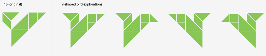
These shapes are very abstract if you’re looking at them as birds, but work really well as the letter “v”.
Pushing it further, I expanded my explorations into color to help the bird take form. I “cheated” the tangram puzzle by adding a circle for an eye, and towards the end started to play around with overlapping the shapes.
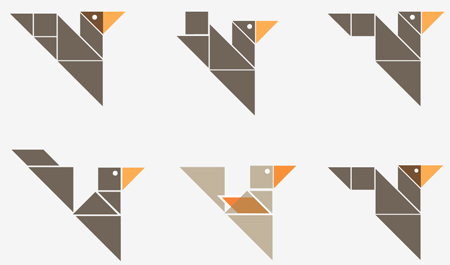
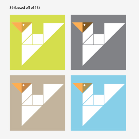
I really like the light tan bird in the bottom row (E), but it completely fails as reading as the letter “v”, as does the bird above it (B). The bird in the upper left corner (A) works, but has one too many tangram shapes.
And the bird in the upper right corner (C) is one shape too short:

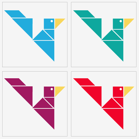
The bird from the bottom left corner (D) uses the right amount of tangram shapes, works well in two colors, and still reads as a “v” if I keep the color of the beak light enough. Here are a few color explorations:
Still not completely satisfied, I wanted to push how the color is used on press. The bird from the bottom right corner (F) works almost perfectly if I overlap the medium size triangle over the small one, defining the head and creating a bit more depth to the design. The colored square in the background is fun, but it’s making the bird’s body read less like a “v”.

And since I’m limited to two passes through the press it won’t work, unless I do something like what’s in this bottom right corner, where the body knocks out of the background color.
By mirroring the image and reducing the design down to two passes, I get closer to making the “v” letter form more apparent. (Although I am on the fence about whether flipping the image helped.) The darker colored backgrounds, which give more contrast to the white, work better than the light backgrounds:

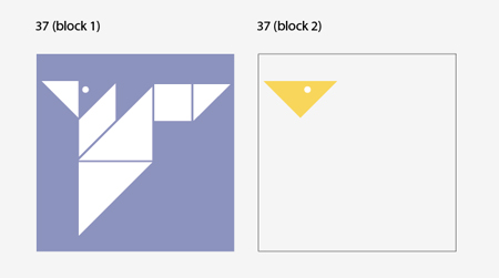
This is what the two linoleum blocks for this design would look like; you can see that I really do stay true to using all tangram shapes. The final shape, in block 2, would overprint block 1 so that the yellow sits on top of the blue:
These color combos could also work. I like the cheerfulness of the blue, but the white “v” really pops well off the gray square… but living in cloudy Seattle I’m a little adverse to using gray:
I admit that these really push the limits of being the letter “v”. I’ve enjoyed the process of working with tangrams, and although these earlier explorations could lead to a good “v” design for The Every Letter Project, at the end of the day I’d rather have one of these playful birds hanging on my wall. And the marketing side of my brain says they might sell better, too… leading to more financial support for 826 Seattle.
What are your thoughts? Constructive feedback welcome.
____________________________
With over 17 years of experience in agency and studio settings, Amy Redmond is a visual designer who thrives on variety, creating print and interactive work for corporate and non-profit clients. To keep her creativity refreshed, Amy balances digital design with time in her letterpress studio (Amada Press) in Seattle. She also teaches at the School of Visual Concepts.


